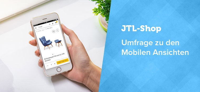
Our JTL-Shop is getting a new look with version 5. By popular request, we are presenting the most important mobile views of the new NOVA template to you today. We use animated gif files to present the views. If you cannot play the files, you will find a normal view below the text. At the end of the blog post you will find our survey form. Once again, we look forward to every store owner and every store agency taking part in our survey.
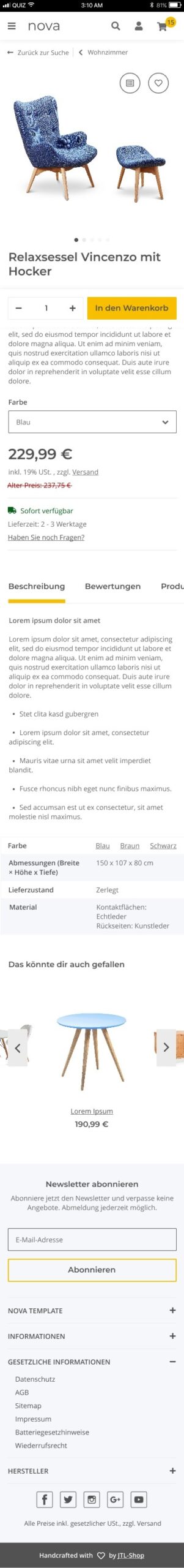
Product detail page on the cell phone
On the detail page, you present your product to the customer in full detail. The product description, variants, special prices, legal provisions and much more must also be taken into account in the mobile views.

Call to action: The shopping cart button and quantity information are pinned to the bottom of the screen. This means the customer doesn’t have to search for long once they have decided to buy.
Product description: Details of the products are arranged in tabs, which the user can also swipe (slide). This makes it possible to keep the page short, but still accommodate all the information.
Footer: Additional information in the footer, for example on shipping conditions, has been placed in an accordion.
Usability: The click areas (touch points) have been optimized in size so that visitors with larger hands or smaller smartphones can also use the mobile views more easily.
Prices: If a product is discounted, the reduction is now highlighted more prominently. Otherwise, the price display is comparable to the previous template.
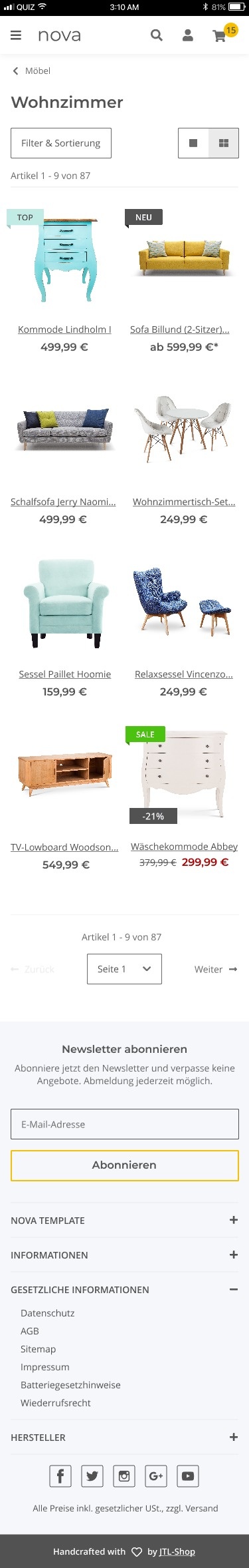
Category view as mobile version
In the category view, customers want to be able to compare products directly, remember items, recommend them or add them to their shopping cart.
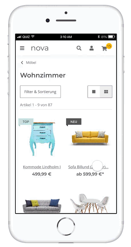
Layout: Your visitors can choose between a one-column and two-column product presentation. With the 1-column layout, the product images are more important to the customer – and they can put together a wish list and compare products directly. For a better overview, i.e. to view more products at once, the visitor chooses the two-column layout.
Flag: The flags for top product, bestseller etc. have been given a new, slimmer form. An additional percentage flag has also been added, which can signal a discount directly on the product image in addition to other flags.
Compliance with legal requirements: No shopping cart direct function may be displayed if not all legally relevant information is displayed. This has a particular impact on mobile views.
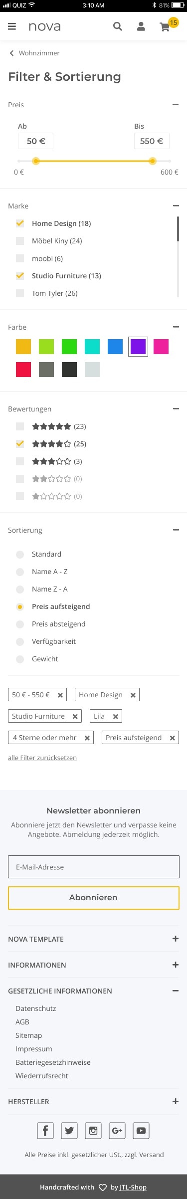
Filter display in the mobile views
If a customer selects multiple filters in the category view, JTL-Shop 5 can further restrict the search result or expand it to include the results of the second filter. In the mobile view, the filters have been made clearer and more streamlined.
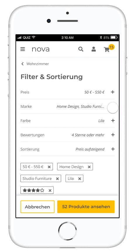
Access filters: A button right at the start of a category view now makes the filter more quickly accessible.
Select filter: Some stores have many filters and even more values. The selection of filters is therefore now made clearer by an accordion and a scrolling bar appears if there are a lot of category values.
Hit rate: The pinned button at the bottom of the page contains information on how many products the current filter settings result in. The down payment is updated live when a filter is activated or disabled.
Price slider: The price filter has been optimized by drag & drop. At the same time, the store visitor can also click or enter the price.
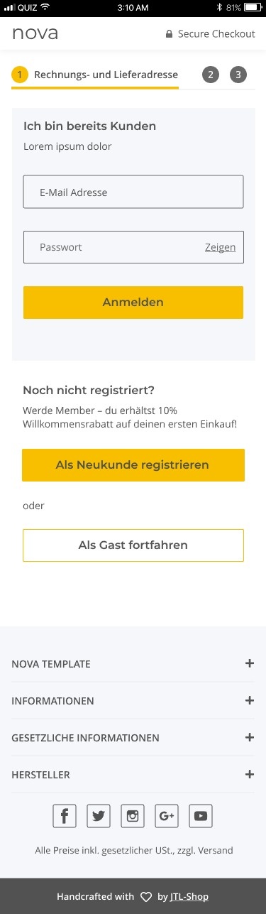
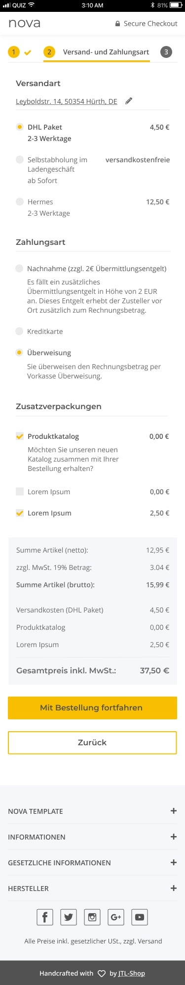
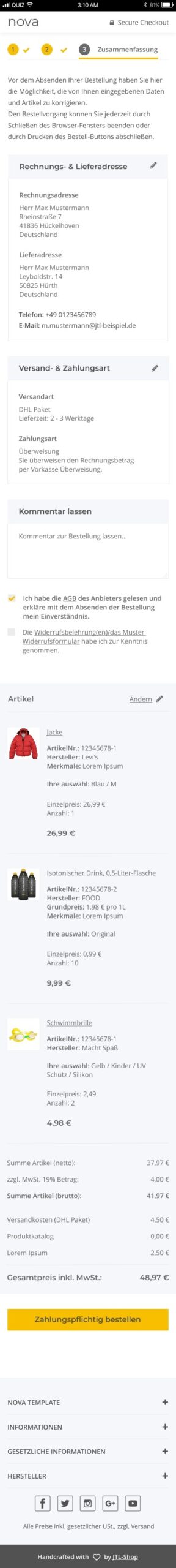
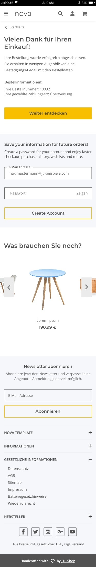
Checkout via smartphone
Another very important element is the checkout. For technical reasons, we currently have to adhere to the three-step checkout in the design and also adapt to changing legal requirements.
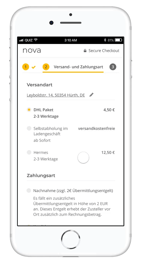
Checkout: As before, the checkout process consists of three steps plus a confirmation page. Nothing can currently be changed on the design side due to the technical integration.
Legal requirements: The focus was also on current legal requirements. For example, the purchase button must be at the bottom of the purchase confirmation page, directly after a highlighted box showing the total price of the order including shipping costs, etc. Nothing may be placed between the final price and the purchase button. There must be nothing between the final price and the purchase button. These rules serve the purpose of transparency for the customer.
Buy as a guest: Indispensable for many store visitors, but not always wanted by retailers: the checkout as a guest option. In the current user guidance, we try to persuade interested guest customers to register on the confirmation page, which is displayed directly after the order has been completed.
Survey on mobile views
The desktop versions of NOVA and OPC
In our first survey, we already introduced you to the desktop versions of NOVA Template and OnPage Composer. If you haven’t given us any feedback yet and would like to do so now, you can find the direct links to the blog post here:
- Start contribution from the beginning
- Part 1: Product detail page
- Part 2: Category view
- Part 3: OnPage Composer
Thank you again for your participation in our store survey. In a few weeks you will find a summary of the survey results here in the JTL forum.
Best regards,
Your team from JTL
