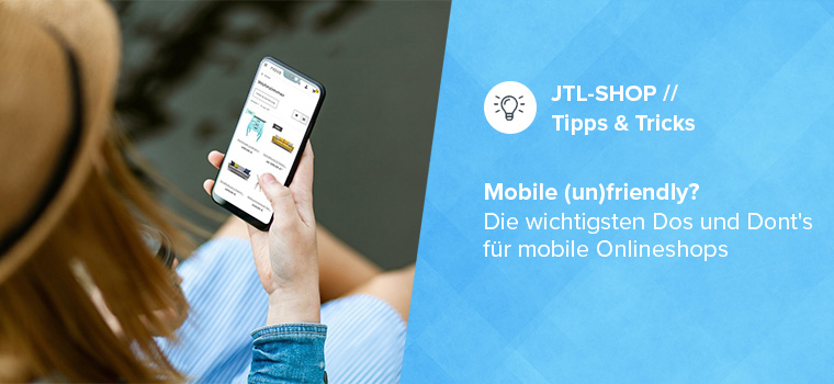
Shopping on the go with your smartphone – in theory, this is practical and convenient. In practice, long loading times and poor usability often rob customers of their nerves and eCommerce retailers of sales. To save you from making the biggest mistakes when it comes to mobile online stores, in this article we get to the heart of the most important dos and don’ts – and with additional tool recommendations from our JTL-Store extension store, we also provide you with the necessary tools!
Germans prefer to surf via smartphone
Scrolling through your favorite online store on the train and discovering a discount promotion – but just as you’re about to complete the purchase, you reach your stop. When you look at your cell phone again after getting off the train, the page simply won’t load. Hardly any customer will make up for the missed purchase at home. Yet shopping with mobile devices is the number one usage scenario, as the current Postbank digital study shows. The consumer behavior of younger “digital natives” in particular is linked to the smartphone. Optimizing your mobile store is therefore more than just a technical upgrade. It strengthens the future viability of your business!
Mobile online stores: These are the areas that matter
Mobile commerce essentially depends on three core areas: Design, usability and IT. As you will see below, these cannot be clearly separated from each other and are mutually dependent.

Responsiveness - the basis of every mobile online store
Every mobile online store starts with the template, as this design and structure template influences important factors such as loading time and technical handling. A responsive template is necessary so that the structure and layout can be adapted to different screen formats while still being appealing and clear. Fortunately, these are now standard.
When choosing a template, you should first be clear about your priorities. After all, it’s not just the different screen formats that make it difficult to satisfy everyone 100 percent. The operating system (Android, iOS) also plays a role. Ideally, you should use targeted traffic analyses to find out which devices your customers use most frequently.
“NOVA”, the basic template of JTL-Shop 5, offers clarity on all devices thanks to its streamlined design. As the back end of our store system is also responsive, you can also work on your online store on smartphones or tablets and intervene quickly if required.

In the JTL-Extension Store you will find responsive shop templates for every taste.
Keep it simple! The motto for your homepage
If you’re browsing online on your smartphone on the couch in the evening (and perhaps with the TV on), you want to find what you’re looking for quickly. Clear navigation and a well-structured homepage are a minimum requirement here. Otherwise shoppers will migrate to the competition faster than you would like! A “foolproof” – also known as intuitive in specialist circles – page structure is also essential for the mobile web store. The customer must be able to recognize where they are at first glance. After all, mobile online shopping usually happens on the side.
The homepage of your online store should also appeal to two customer groups: those who know exactly what they are looking for and those who still want to browse. The former needs a sophisticated search function with detailed filter options by category, price, etc. The search and filter function in particular should be easy to find, as it is one of the top points of contact for new customers.
You get an intelligent search function with JTL-Search. The tool supports error-tolerant searches and synonym searches.
Customers who like to browse, on the other hand, enjoy a large tile design with images that arouse curiosity. Use appealing images, especially on the homepage. In the header, the “head” of a website, you should place core elements such as the logo, main navigation, search bar and shopping cart. In order not to overload the small smartphone screens, you also need to prioritize so that important content is not only visible after a long swipe. With a minimalist structure consisting of images, headlines for the most important store categories and cleverly placed call-to-action buttons, you are on the safe side. For mobile online stores, the more there is to look at, the better!
The “Video in article image gallery” extension in the JTL Extension Store quickly enhances the look of your product presentations.
Mobile usability and the "rule of thumb"
An often neglected usability rule: the most important navigation and main elements should be accessible in the “thumb-friendly zone” – the area that can be easily tapped with the thumb. Even large fingers must be able to swipe precisely. The customer must be able to execute commands such as swiping (horizontal swiping), pinching (pinching together or pulling apart the fingers to zoom in and out) or flicking (nudging to get to the top or bottom of a page) at will.

You don't keep customers waiting - not even with long loading times!
User studies have shown that long loading times cause the most abandoned purchases. Optimizing the format, resolution and quality of the images is crucial here. Make sure you find a good compromise between quality and file size right from the start and ensure that only the image sizes that can actually be displayed on the respective device are loaded. If possible, use modern image formats such as WebP. With JTL-Shop 5, you don’t need to worry about this, because our shop system automatically plays JPG and PNG files in the modern WebP format and thus speeds up data retrieval.
Lazy Load” is also integrated in JTL-Shop 5. With this technology, content is only loaded when the user scrolls it into view. Responsive image loading optimizes the images for the device your customer is using to browse the online store. In addition to the images, a “lean” CSS and JavaScript code also has a significant impact on the loading time.
If speed is important to you, you should take a look at the Snacky template. You can test the template for JTL-Shop 5 for 14 days free of charge.

It’s not just customers who are put to the test with long loading times. Google has been reviewing the speed and user experience of a website as a ranking factor for some time now. From an SEO perspective, you should therefore also strive for short loading times. Google’s “Mobile First Strategy” encourages website operators to make their listings fit for smartphones with free tools such as “Test My Site”. You can read proven basics for search engine optimization in your online store in this blog post.
Thanks to extensions such as the JTL Speed Optimizer, you don’t have to learn how to program yourself to adjust the “speed”. With it, you can achieve a noticeably faster display of your online store content.
Mobile optimization pays off!
The development of mobile online stores is one of the supreme disciplines in eCommerce. From design to programming, you have to take many factors into account and coordinate them in a targeted manner. In addition, the mobile version of an online store depends heavily on the target group and the products sold. However, if you take the time to develop it, obtain expertise and repeatedly subject your mobile online store to practical tests, you are on the right track.
With solutions like JTL-Shop 5 and platforms like the JTL-Extension Store, we want to support you in the best possible way!
