
In the previous two parts of our blog series, we presented the JTL-Shop plugin Dropper and many drops in detail. In the first part, we showed you how easily you can enhance parts of your JTL-Shop with ready-made drops and in the second part, how you can put together entire landing pages with just a few clicks. This provides you with a powerful tool for implementing an individual content strategy in your store.
However, the true strength and flexibility of Dropper only unfolds when you go a little further and develop your own custom drops. As Dropper was designed as an open system from the outset, this is easily possible. You can find out how this works in this third and final part of our series of articles on Dropper and intelligent content management for the JTL-Shop.
Please note that custom drops can only be carried out with the “Silver” or “Gold” dropper plans. However, all functionalities are of course available to you during the 14-day test phase.
All beginnings are easy - building a custom drop
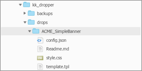
A drop is basically nothing more than a folder that must be stored in a specific location and contain certain files in order to be recognized as a drop by Dropper. Similar to a plugin in the JTL-Shop.
A simple drop contains at least the config.json and template.tpl files. config.json defines the input elements of the drop and the template.tpl file provides the layout for the data output. Other elements are optional. However, a suitable CSS file (style.css) for styling the output and a text file for documenting the drop (Readme.md) are common and recommended. A simple drop will therefore have the following file structure:
A simple example: Simple Banner Drop
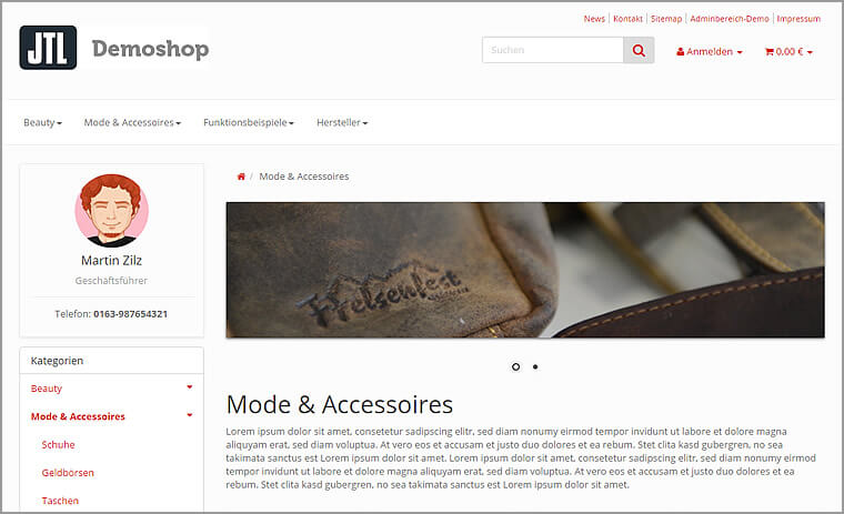
The folder structure shown already reveals our simple example drop, which we will now develop below. The aim is to use this drop to output an image with a caption, i.e. a simple banner.
Step 1: Define data and settings
In config.json, we define which options our drop provides in the dropper back end and what its data structure looks like. Numerous meta information about the drop is also recorded here and other files are linked. The content of config.json in our example looks like this:
{
/* Metaangaben des Drops */
“name” : “Simple Banner”,
“description” : “Stellt einen einfachen Banner bereit.”,
“version” : “1.0.0”,
/* Verweis auf externe Dateien */
“stylesheets”:[“style.css”],
/* Eingabeelemente des Drops */
“settings”: [
{
“name” : “Bild”,
“description” : “Bannerbild”,
“type” : “upload”,
“property” : “image”
},
{
“name” : “Bildunterschrift”,
“description” : “Text unter dem Bild”,
“type” : “html”,
“property” : “subtitle”,
“multilanguage” : true
}
]
}
With these few details alone, we have already defined the input elements (here: an image and a text). The desired data or content for our drop can already be entered in the dropper back end without any further action.
With these straightforward and simple definitions in config.json, we have solved several problems that we would have encountered when collecting the data during the development of a plugin with a similar function. To name just a few:
Dropper gives us access to numerous input elements, which we can define almost arbitrarily in our own drops. You can find an overview of the available controls in our wiki. Many other things can also be defined in config.json that would simply go beyond the scope of this article. Here, too, our developer wiki offers you many details on the possibilities.
Step 2: Determine template and styling
Our recorded data must of course still be output, the basic structure of this output is defined by template.tpl.
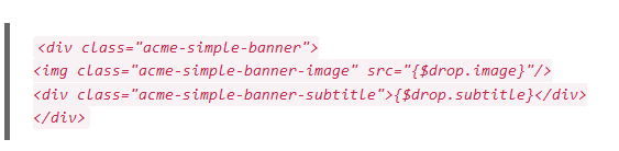
With {$drop.image} and {$drop.subtitle} we get access to the image path and subtitle of our banner. We display this data with simple HTML elements, which we in turn style with some basic CSS rules:
.acme-simple-banner {
border: 1em solid #ddd;
}
.acme-simple-banner-image {
width: 100%;
}
.acme-simple-banner-subtitle {
text-align: center;
padding: 1em;
font-size: 2em;
background: #f1f1f1;
}
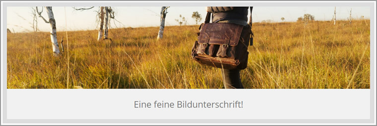
All this is enough to generate the following output with an image and a short text:
Dropper also provides us with the important functions for the output of the drop:
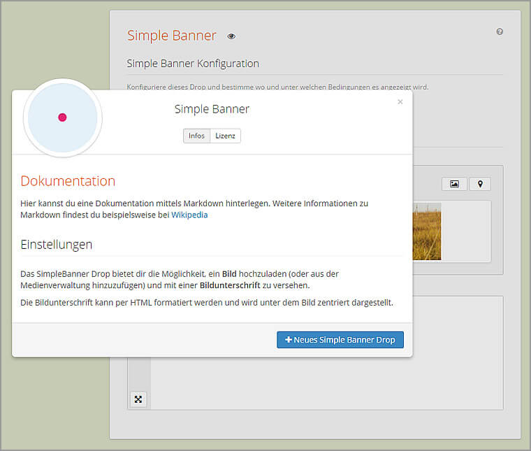
Step 3: Document your own drop
Good documentation should not be neglected. With Markdown, we have therefore provided a markup language that is as easy to use as possible in order to provide you with clear documentation for your own drops.
# Documentation
Here you can store documentation using Markdown. You can find further information on
Markdown at [Wikipedia](https://de.wikipedia.org/wiki/Markdown), for example.
## Settings
The SimpleBanner Drop offers you the option of uploading an **image** (or adding one from the
media management) and adding a **caption**.
The caption can be formatted using HTML and is displayed centered below the image
.
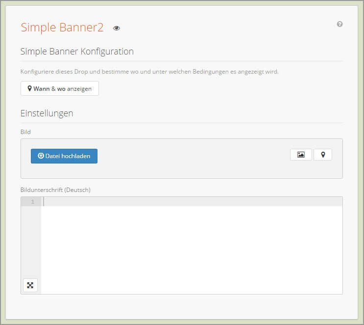
The documentation generated by the Markdown file is automatically linked in the drop and would then look something like this in the dropper back end:
We did it! A finished drop created in just 10 minutes.
We’ve barely started and we’re already finished. With just a few lines of code, we have created the ability to insert simple image banners into our JTL-Shop. Dropper not only takes care of providing appealing input options for the desired data, but also offers multilingualism, backups, export and import functions as well as simple documentation options that every developer can also use for their custom drops!
A more complex example: Supporter Drop
Our colleague Martin showed another nice application option in a developer workshop on custom drops. Here he creates a more complex drop that assigns selected support employees to specific store categories and then displays them to visitors as contact persons in the store.
We have also recorded the approximately 80-minute workshop as a video on YouTube. It shows almost all the concepts and functions that can be realized with custom drops. So it’s definitely worth a look for all those who have already been intrigued by our Simple Banner Drop. The video is also linked in our developer wiki, where you can also find the source files for the two example drops shown above!
"Drop-a-Day" - A developer workshop with us on site
If you would like to develop your own custom drops live with us and in a great atmosphere, we cordially invite you to our Drop-a-Day on 26.04.2016 in Radebeul near Dresden.

With Schloss Wackerbarth, we have chosen a location that offers a great backdrop and ideal conditions for such a day. We have planned enough time for a lively exchange of experiences. You can find more information at: Drop-a-Day with Kreativkonzentrat. We are looking forward to it!
Finally, we would like to thank you very much for your attention. We hope that our three-part article has given you a better understanding of the advantages of Dropper for JTL-Shop and its many possible uses. If you have any suggestions or questions, please feel free to comment here or contact us directly.
Until then, your Kreativkonzentrat!
